

Table of Contents
Introduction
Learn HTML and CSS for beginners by creating a fully responsive Flickr Clone Project.
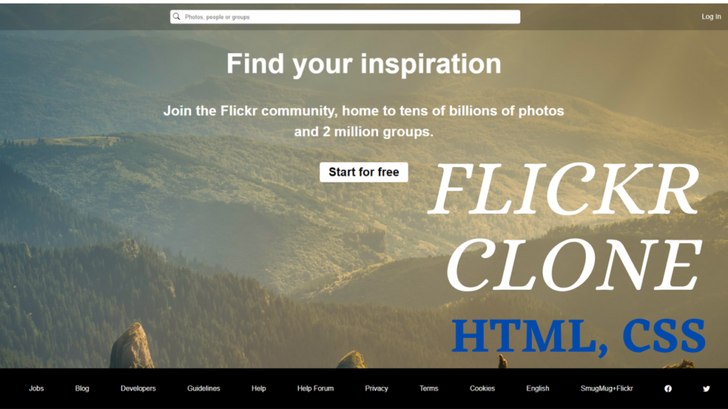
Below is the flickr clone project sample image:

Layout in HTML (index.html)
The layout for this project includes header, main and footer sections; header contains logo, search box, login and sign up buttons, main section contains a h1, a h3 and an anchor tag and the footer contains various links .
View Other Projects Here<!DOCTYPE html>
<html>
<head>
<title> Flickr Clone </title>
<meta charset="utf-8">
<meta name="viewport" content="width=device-width, initial-scale=1.0">
<link rel="stylesheet" type="text/css" href="style.css">
</head>
<body>
<header>
<div class="logo">
<img src="images/flickr-logo.png"> flickr
</div>
<div class="search">
<label for="search_box">
<i class="bi bi-search"></i>
</label>
<input type="text" id="search_box" placeholder="Photos, people or groups">
</div>
<div class="auth_buttons">
<a href="#"> Log In </a>
<a href="#" class="btn"> Sign Up </a>
</div>
</header>
<main>
<h1> Find your inspiration. </h1>
<h3> Join the Flickr community, home to tens of billions of photos and 2 million groups. </h3>
<a href="#" class="btn"> Start for free </a>
</main>
<footer>
<a href="#">About</a>
<a href="#">Jobs</a>
<a href="#">Blog</a>
<a href="#">Developers</a>
<a href="#">Guidelines</a>
<a href="#">Help</a>
<a href="#">Help Forum</a>
<a href="#">Privacy</a>
<a href="#">Terms</a>
<a href="#">Cookies</a>
<a href="#">English</a>
<a href="#">SmugMug+Flickr</a>
<a href="#"><i class="bi bi-facebook"></i></a>
<a href="#"><i class="bi bi-twitter"></i></a>
<a href="#"><i class="bi bi-instagram"></i></a>
</footer>
</body>
</html>Styling using CSS (styles.css)
We are fetching bootstrap icons from bootstrap icons CDN (link below). The project has breakpoints 768px and 992px to make it responsive.
Bootstrap Icons CDN Link: https://cdn.jsdelivr.net/npm/bootstrap-icons@1.3.0/font/bootstrap-icons.css@import url("https://cdn.jsdelivr.net/npm/bootstrap-icons@1.3.0/font/bootstrap-icons.css");
* {
margin: 0;
padding: 0;
}
body {
background-image: url('images/nature-pic.jpg');
font-family: sans-serif;
}
body a {
color: #fff;
text-decoration: none;
margin-left: 15px;
}
body a.btn {
padding: 7px 20px;
background: #fff;
color: #000;
font-weight: 700;
border-radius: 5px;
}
header {
display: flex;
align-items: center;
justify-content: space-between;
background: rgba(0,0,0,0.2);
padding: 15px;
}
header .logo {
display: flex;
align-items: center;
color: #FFF;
font-size: 1.7rem;
}
header .logo img {
width: 30px;
margin-right: 10px;
}
header .search {
display: flex;
align-items: center;
}
header .search label {
background: #fff;
color: #000;
padding: 6px;
height: 20px;
border-top-left-radius: 5px;
border-bottom-left-radius: 5px;
}
header .search input {
padding: 5px;
width: 40vw;
height: 20px;
border-top-right-radius: 5px;
border-bottom-right-radius: 5px;
outline: 0;
border: 1px solid #eee;
}
main {
display: flex;
padding: 40px;
flex-direction: column;
justify-content: space-between;
width: 50vw;
margin: auto;
color: #fff;
text-align: center;
}
main h1 {
font-size: 4rem;
margin-bottom: 3rem;
}
main h3 {
font-size: 2rem;
line-height: 3rem;
}
main a.btn {
width: fit-content;
margin: 5vh auto 0;
font-size: 1.7rem;
font-weight: bold;
}
footer {
position: absolute;
bottom: 0;
width: 100%;
height: 10vh;
background: #000;
display: flex;
justify-content: space-evenly;
align-items: center;
}
@media (max-width: 992px) {
footer {
flex-wrap: wrap;
}
}
@media (max-width: 768px) {
header {
flex-direction: column;
}
header div {
margin-bottom: 15px;
}
header .search input {
width: 80vw;
}
header .auth_buttons {
margin-top: 15px;
}
main {
width: 85vw;
padding: 20px;
}
main h1 {
font-size: 2rem;
margin-bottom: 1rem;
}
main h3 {
font-size: 1.5rem;
line-height: 2rem;
}
main a.btn {
margin: 3vh auto 0;
font-size: 1.5rem;
}
footer {
flex-wrap: wrap;
height: auto;
}
footer a {
margin: 15px;
}
}
@media (max-width: 375px) {
footer a {
margin: 10px;
}
}Video Tutorial
