
Table of Contents
- Introduction
- How to use?
- How to create a Pie-Chart using conic-gradient?
- Video Tutorial
- Find More Projects
- Learn More about conic-gradient
Introduction
There is no any need to use JavaScript based plugin for creating a pie-chart. CSS provides a conic-gradient() function that can be used as a background for any div and can generate a pie-chart structure with a little styling.
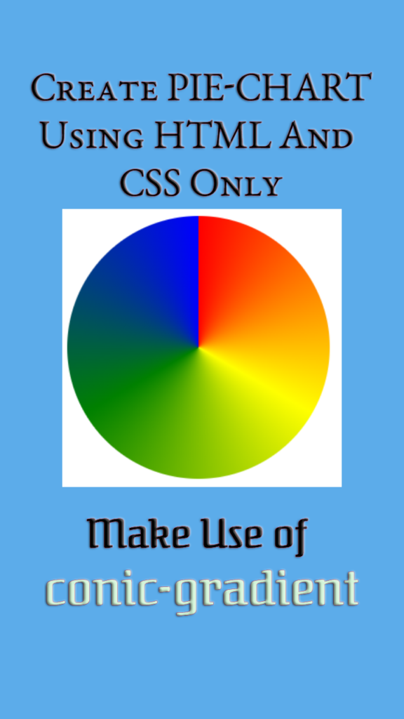
See the demo image below:
How to use?
Basic Conic Gradient
Similar to linear and radial gradients, we can use two colors to create a conic gradient. By default, CSS distributes 50% mark for both the colors.
.basic-conic {
     background: conic-gradient(yellow, green);
}
Output

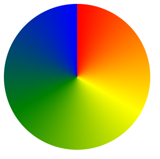
How to create a Pie-Chart using conic-gradient?
We looked into using the conic-gradient with example above. Now the question remains, how to make use of the conic-gradient to create a structure. Let’s take a look into the HTML and CSS used for designing it.
Code (Includes HTML and CSS)
<!DOCTYPE html>
<html lang="en">
<head>
	<meta charset="UTF-8">
	<meta name="viewport" content="width=device-width, initial-scale=1.0">
	<title>CSS Pie-Chart</title>
	<style>
		#pie{
			width: 300px;
			height: 300px;
			background-image: conic-gradient(red, yellow, green, blue);
			border-radius: 50%;
		}
	</style>
</head>
<body>
	<div id="pie"></div>
</body>
</html>
Output
Video Tutorial
Find More Projects
https://thinkshare.one/learn/projects/
Learn More about conic-gradient
https://developer.mozilla.org/en-US/docs/Web/CSS/CSS_Images/Using_CSS_gradients
If you have any issues, feel free to let me know by leaving a comment below.